Turning static into
intent.
Redesigning STAGE's homepage poster from a passive visual into an interactive preview experience that drives content discovery.
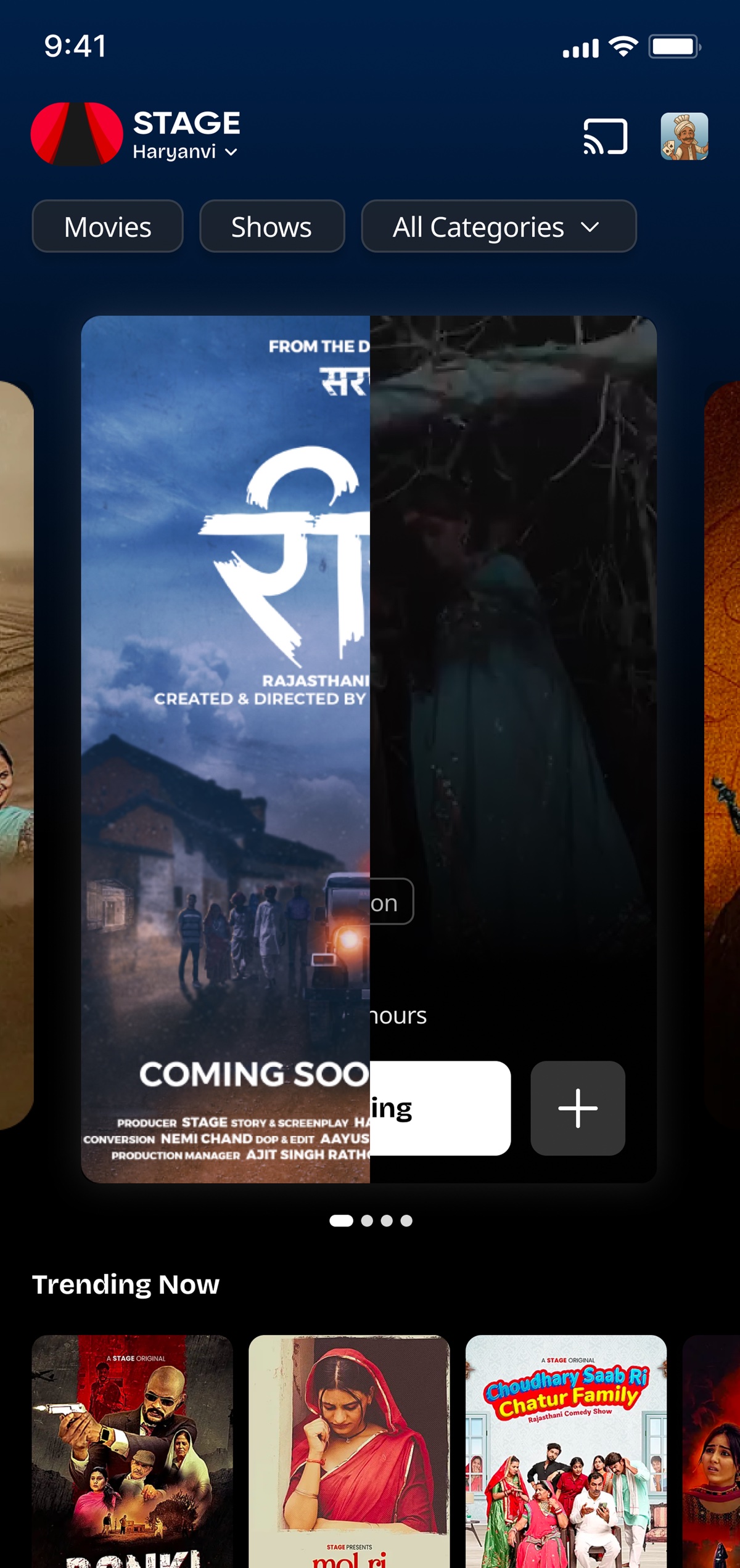
The 19.6% problem
STAGE's homepage poster looked good but wasn't doing its job. Only a fraction of users who saw it actually tapped through to content. The data told a clear story: the poster was wallpaper, not a doorway.
Three things were broken. None of them flashy on their own, together, they explained the leak.
What everyone else missed
I audited four major streaming and content platforms. Every single one treated homepage posters the same way, big image, text overlay, CTA button. The pattern was so universal that nobody was questioning whether it worked.
The gap wasn't visual quality. It was interaction cost. Users were being asked to make a decision with almost no information. The poster gave them a mood, not a reason.


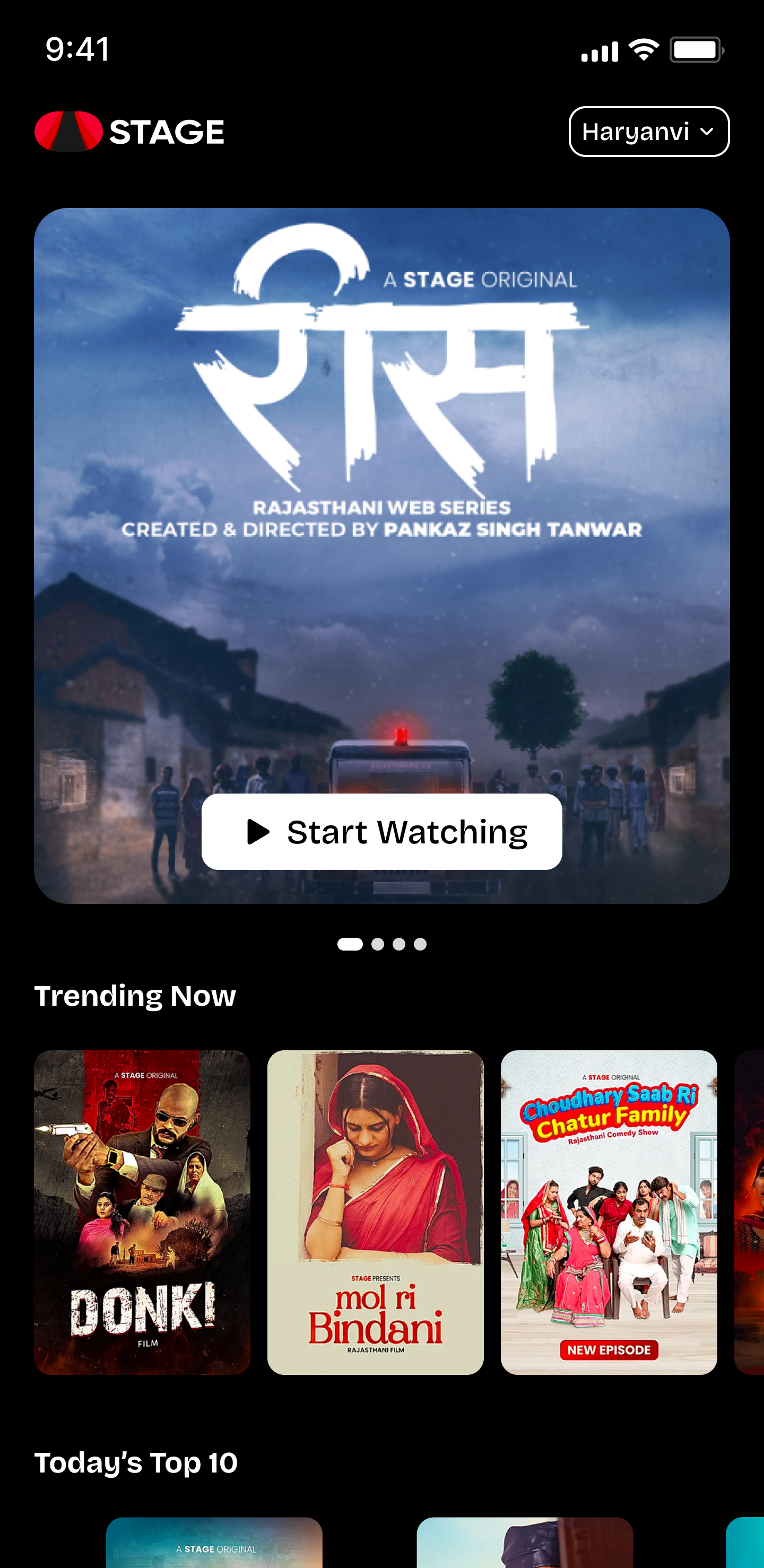
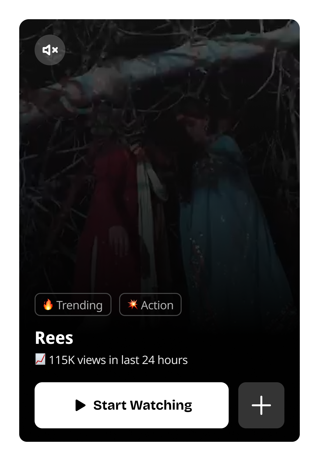
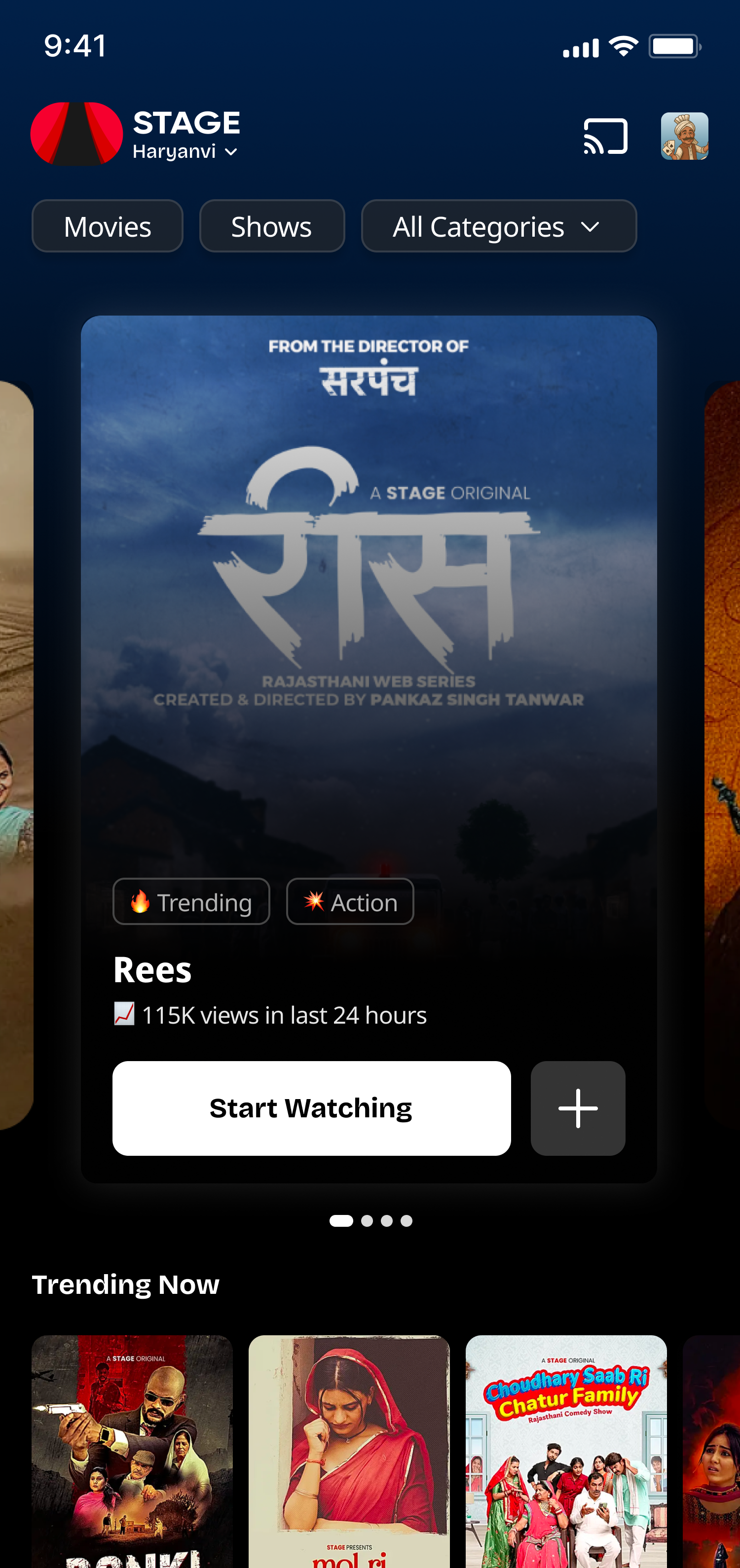
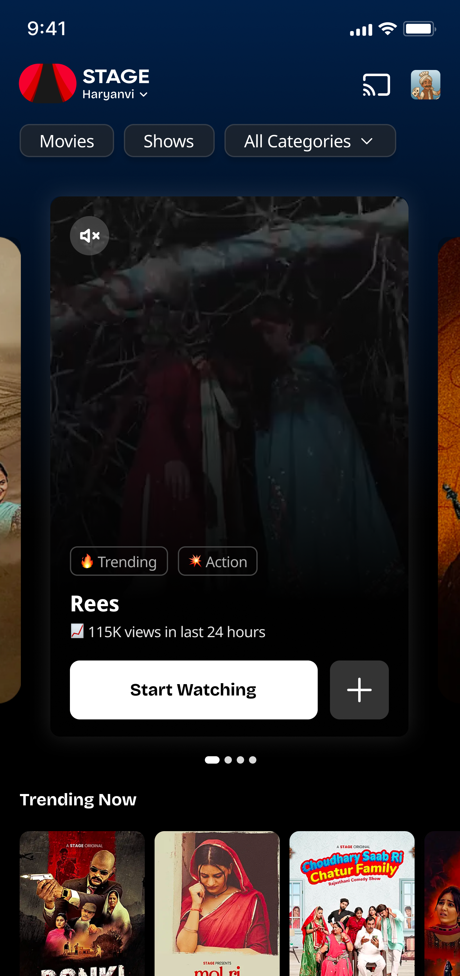
What if the poster wasn't a poster, but a preview?
Instead of a static frame, I explored turning the platter into a short, motion-driven preview, giving users a taste of the content before they committed. The goal was to reduce the decision cost to near zero.
Research on the Mere Exposure Effect suggests that even brief, passive exposure increases familiarity and preference. A 2-3 second motion preview could do two things at once: inform the decision and build subconscious interest.
Designing around real constraints
This wasn't a blank canvas. The homepage has rules, and the poster has to survive them all.
A two-ratio system
I designed a system that adapts the poster into two states, a static ratio for the default view and a motion ratio for the preview, and transitions between them seamlessly.
The static state works exactly like the current poster: clean, art-directed, optimized for the hero slot. The motion state activates on pause, expanding the aspect ratio to accommodate a video preview without disrupting layout.

Three frames of an interaction
The principles guiding the design, read as a storyboard rather than a list.

The directional signal
I tested the redesigned poster against the original across a 7-day A/B test on the STAGE platform.